My statistical hypothesis about bubbles is very simple: when we make step-ahead predictions we cannot see bubbles. It doesn't matter whether you make step-ahead predictions with a complex econometric model, by drawing lines on graph paper (called technical analysis charting by stock market analysts) or by expert opinion (guessing). The problem is that the current value of the time series you are trying to predict contains non-random, systematic errors that have accumulated over time.
To see the bubble (which itself is an accumulation non-random, systematic errors), you have to eliminate those errors from your forecast. To do that, you have to make your forecast over a long period of time, sometimes up to fifty years or more. You can't do that kind of forecast with expert opinion and long time periods are typically not used for technical analysis charting. For this purpose you need a model that can be run over time as a free simulation. In a free simulation, some initial condition is chosen and then the model is run forward in time without using the historical values of the dependent variable to reset the model at any point. If a model has exogenous variables, those variables must also be the result of a free simulation, that is, without input errors.
A free simulation produces the dynamic attractor path for the time series you are trying to predict. The bubble (sometimes called overshoot) is movement away from the attractor path. The collapse (bubble pop) is movement back toward the attractor. Over-correction is when the system collapses below the attractor path.
Any formal mathematical model can be used to generate an attractor path for the system it is modeling. Not all of these attractor paths will be very good (the system Q(t) = a, where a is a constant such as the mean, generates one attractor path for the quantity Q but would not usually be very useful). To determine the best attractor path, we have to have multiple models and then apply some criterion to determine the best model. A useful criterion for this purpose is the Akaike Information Criterion (AIC) which takes the attractor path with the smallest residuals corrected for the number of predictor variables. The AIC chooses the simplest model that produces the best free simulation.
Of course, dynamic attractor theory is just a theory and it needs to be tested against actual models and actual data. In various places, I have been trying to do that for the last few years. I have not tried every possible mathematical model but have concentrated on state space models because they take a systems perspective. Any model will work as long as the model developer is willing to publish the AIC statistic for the free simulation. Here are some examples of the attractor paths generated by the models I have been using.


Iceland provides another example of extrapolating growth from current trends without realizing that these projections are really the beginning of a bubble (here). As with Germany, Iceland also went through a period of Neoliberal reforms after poor performance from the mid-1980s to the mid-1990s (perpendicular red lines in the graph above). From the mid-1990s to the Financial Crisis of 2007-2008, Iceland's growth looked spectacular but was actually based on financialization rather than sustainable economic growth. In 2010, the Icelandic economy returned to its attractor path generated by the IS20 model (the attractor path is the result of simulating the model starting in 1960 rather than making year-to-year projections which are based on bubble-generated, nonrandom errors).

The same thing happened in the US starting in 2003 (here). The Bush II Administration (2001-2009) started out with a period of underperformance as a result of the 9/11 Terrorist Attack on the World Trade Center. However, starting in 2003 the economy took off and grew rapidly until the peak in 2007 and collapse in 2008. That this was a bubble can be clearly seen from the attractor path created by simulating the USL20 model starting in 1950. Growth during the Bush Bubble was clearly the result of Neoliberalism and financialization. The financial innovation of mortgage-backed securities (MBS, the acronym should giveaway what this was all about) created a bubble in the US housing market that was popped when low introductory-rate mortgages reverted to regular interest rates that borrowers were unable to pay.


If you only use a forecasting model, you might conclude that a country did not experienced a bubble during the 2007-2008 Financial Crisis and Great Britain provides a good example (here). The graph above shows the real GDP forecast for the United Kingdom. For most of the late 20th century, the British economy stayed within a very narrow range around the forecast line (the best attractor for the GB GDP model is driven by the North American economy, that is, the NAC20 model). My conclusion from this result is that the British Austerity experiment which generated so much pain for the country was largely unnecessary (it is another question whether Austerity is useful under any circumstances).
 However, if you look at the attractor path for GDP in Great Britain, you can very clearly see the bubble developing after 2000 when the economy gets above the 98% prediction interval (upper dashed red line). You can also see that the return to the attractor line in late 2009 stayed within the lower 98% prediction interval (lower dashed green line). From this perspective, the Austerity experiment was still basically unnecessary. In general, the economy of the United Kingdom showed cyclical performance during the post-Neoliberal (post-Thatcher) period and did not seem to take-off until the early 1990's. However, the period from the early 1990's until the 2007-2008 Financial Crisis was both a return to the attractor line (around 2000) and then over-shoot from 2000-2007.
From the standpoint of attractor theory and the explanation of bubbles, the difference between the last two graphs is simply that in the forecast graph, step-ahead predictions are being made. In the attractor path, the model is given initial conditions in 1960 and then is simulated forward until 2015. Year-to-year cumulative errors, the kind of nonrandom errors that generate bubbles, are not include. The same model generated both graphs, the simulation methods were just different.
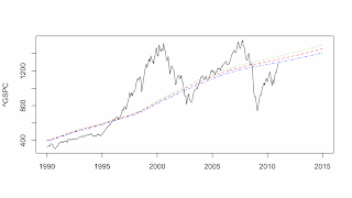
There appear to be two conflicting views surrounding stock market bubbles. The Behavioral Finance view is that stock market bubbles are the result of irrational exuberance, that is, booms and panics are created by the irrational behavior of investors. The Efficient Market Hypothesis (EMH) holds that (1) prices contain all the information available about stocks so prices are rationally determined and (2) that future prices cannot be predicted because stocks follow a random walk model. These two premises imply that there cannot be bubbles, that is, the stock price is what it is and a random walk has no attractor value, that is, the stock price can be anything. I am exploring the EMH in another place (here). So far, using multiple state space models and the AIC criterion, I have found very few stocks that are best described by a random walk and, looking at the attractor path for the SP500 index (^GSPC in the graph above), we can very clearly see the Dot-com Bubble and the Subprime Mortgage Crisis. Interestingly, the best forecasting model for the SP500 is the US economy (the state variables of the USL20 model) while the best attractor model for the SP500 is the World economy (the state variables of the WL20 model).
 One of the stocks that I have studied in most detail is Apple Computer (AAPL, here). My interest was driven not only by the constant barrage of attention given to AAPL on the financial news networks but also by my ownership of AAPL stock, that is, until September of 2012 when my models were screaming SELL, SELL, SELL (as were my financial analysts). From the dynamic attractor graph above we can clearly see that AAPL was, for much of 2012, in bubble land. Currently, the AAPL stock price is well below the lower 98% prediction interval for the stock and clearly undervalued. However, the time plot of the stock price is not a random walk--the best attractor model is being driven the WL20 model.
Dynamic attractor theory is unlikely to be accepted as an explanation for bubbles. The theory does not say when the bubble will start. The theory does not say when the bubble will pop. The theory does not say when the system will return to its attractor value. What dynamic attractor theory would be useful for is identifying when a bubble is developing. The information could be used by investors (start buying below the attractor path and start selling above the attractor path--the longer you stay in a bubble market the more likely the collapse and the more risk). For governments, economic policy actions could be based on departures from the dynamic attractor path (the US Federal Reserve, for example, could tighten interest rates to reduce the overshoot). Although it may not be possible to eliminate bubbles, it might be possible to reduce their magnitude and reduce the amount of societal damage that results from the collapse.
We are a long way from fully testing dynamic attractor theory. For the future, there are many historical examples of potential bubbles that could be investigated. I will also investigate in detail the existing ideas and theories of bubbles to lay a better foundation for dynamic attractor theory. Finally, all the models have be developed within the public domain R programming language and will also be placed in the public domain. In a future post, I will explain how to access and use the models.
TECHNICAL NOTE: Here are the AICs for the best attractor models presented above: (1) US GDP Model, AIC = 2469.259 (start=1950,n=241), (2) AAPL Stock Price Model, AIC = 3307.542 (start=1984.9,n=329), (3) The Iceland GDP Model, AIC = 2146.228 (start=1960,n=51), (4) The German GDP Model, AIC = 2714.087 (start=1960,N=51), (5) The United Kingdom GDP model, AIC = 2716.058 (start=1960,n=51),and (6) the SP500 model, AIC = 8037.028 (start=1950,n=733). All the AICs were computed from the free simulation, not from the statistical estimates.

From the standpoint of attractor theory and the explanation of bubbles, the difference between the last two graphs is simply that in the forecast graph, step-ahead predictions are being made. In the attractor path, the model is given initial conditions in 1960 and then is simulated forward until 2015. Year-to-year cumulative errors, the kind of nonrandom errors that generate bubbles, are not include. The same model generated both graphs, the simulation methods were just different.


Dynamic attractor theory is unlikely to be accepted as an explanation for bubbles. The theory does not say when the bubble will start. The theory does not say when the bubble will pop. The theory does not say when the system will return to its attractor value. What dynamic attractor theory would be useful for is identifying when a bubble is developing. The information could be used by investors (start buying below the attractor path and start selling above the attractor path--the longer you stay in a bubble market the more likely the collapse and the more risk). For governments, economic policy actions could be based on departures from the dynamic attractor path (the US Federal Reserve, for example, could tighten interest rates to reduce the overshoot). Although it may not be possible to eliminate bubbles, it might be possible to reduce their magnitude and reduce the amount of societal damage that results from the collapse.
We are a long way from fully testing dynamic attractor theory. For the future, there are many historical examples of potential bubbles that could be investigated. I will also investigate in detail the existing ideas and theories of bubbles to lay a better foundation for dynamic attractor theory. Finally, all the models have be developed within the public domain R programming language and will also be placed in the public domain. In a future post, I will explain how to access and use the models.
TECHNICAL NOTE: Here are the AICs for the best attractor models presented above: (1) US GDP Model, AIC = 2469.259 (start=1950,n=241), (2) AAPL Stock Price Model, AIC = 3307.542 (start=1984.9,n=329), (3) The Iceland GDP Model, AIC = 2146.228 (start=1960,n=51), (4) The German GDP Model, AIC = 2714.087 (start=1960,N=51), (5) The United Kingdom GDP model, AIC = 2716.058 (start=1960,n=51),and (6) the SP500 model, AIC = 8037.028 (start=1950,n=733). All the AICs were computed from the free simulation, not from the statistical estimates.